Data Analysis in R for Becoming a Bioscientist

Just sharing some teaching materials which might be useful.

In the Department of Biology at the University of York in the UK, we teach Data Analysis in R from stage 1 to over 400 students. There are “Becoming a Bioscientist” modules in each of semester of the first two years.

These are the stage 1 materials.

In Data Analysis in R for Becoming a Bioscientist 1 students learn some core concepts about scientific computing, types of variable, the role of variables in analysis and how to use RStudio to organise analysis and import, summarise and plot data.

In Data Analysis in R for Becoming a Bioscientist 2 we move on to the logic of hypothesis testing, confidence intervals, what is meant by a statistical model, two-sample tests and one- and two-way analysis of variance (ANOVA)

R Forwards 📦Package Development curriculum for women and other underrepresented people

Emma Rand and Mine Çetinkaya-Rundel

In September, we will be delivering a series of four online one-hour package development workshops. These are:

  1. Packages in a nutshell
  2. Setting up your system
  3. Your first package!
  4. Package documentation
    • 24 September 2021 at 14:00 BST
    • Register!
    • Slides: coming soon!

The modules follow on from each other but depending on your experience, you may not need all of them. This modular approach was used to help people tailor training to their needs and availability.

About R Forwards

R Forwards is an R Foundation task force that was originally set up in December 2015 to address the underrepresentation of women in the R community. An analysis of CRAN package maintainers estimated that fewer than 15% were women, and a useR! participant survey found that women were less likely than men to have experience contributing to or writing packages. In 2017 it was rebranded to accommodate other under-represented groups such as LGBTQI, minority ethnic groups, and people with disabilities.

Why create Package Development modules?

Forwards have delivered face-to-face one-day workshops in Package development, supported by a grant from the R Consortium, for several years. These are heavily based on the R packages book by Hadley Wickham and Jenny Bryan. These have worked well but our reach is limited because only those with access to teaching facilities can deliver the teaching and only those able to attend a face-to-face workshop can benefit from it. This misses a lot of people! Recently, we have been modularising our materials into one hour long workshops that can be delivered online or in person. We hope this makes the material more usable to teachers and learners alike.

Some module design principles

By December we had begun work on our module design principles. Just like the face-to-face-workshops, the modules would teach package development using devtools in RStudio. Our aim is to provide workflows to help people get started rather than an exhaustive understanding of the details (you can see Writing R Extensions for that).

We wanted the collection of modules to be relatively short (~1 hr), ‘stackable’ and easy for others to use. We thought each module should:

  • be approximately 1hr
  • be discrete (standalone) but link to other modules
  • have specified prerequisites and learning objectives
  • be a complete resource for teaching (a person should be able to teach themselves from the material) and include tutor notes
  • have a set of Rmd slides with comprehensive alt text and speaker notes
  • have slides with minimal content but detailed speaker notes
  • use live coding, (minimise ‘lecturing’); include additional exercises for the speedy

Our Progress

In January, Mine and Emma set about developing a module template and the first three modules. We delivered these over consecutive days in February (15th, 16th and 17th) to a great bunch of people. A total of 51 different people took the modules. We were expecting most to do all three but only 19 chose to do all three and 21 people did just one. Perhaps a modular approach did help people tailor training to their needs and availability?

We’re delighted that at least one of our participants, Melissa Wong, has now released a package on CRAN! The package, pomcheckr, implements the method described at UCLA Statistical Consulting for checking if the proportional odds assumption holds for a cumulative logit model.

If you’ve been to a Forwards Package Development workshop and have released a package we would love to hear from you.

If you’d like to go to a Forwards Package Development workshop and have release a package Register at the top of the page!

R Forwards Package development modules for women and other underrepresented groups.

R Forwards is an R Foundation task force that was originally set up in December 2015 to address the underrepresentation of women in the R community. An analysis of CRAN package maintainers estimated that fewer than 15% were women, and a useR! participant survey found that women were less likely than men to have experience contributing to or writing packages. In 2017 it was rebranded to accommodate other under-represented groups such as LGBTQI, minority ethnic groups, and people with disabilities.

Forwards have delivered face-to-face one-day workshops in Package development, supported by a grant from the R Consortium, for several years. These are heavily based on the R packages book by Hadley Wickham and Jenny Bryan. Recently we have been modularising our workshop materials to increase our reach by developing and delivering approximately one hour workshops suitable for online delivery and easy reuse by others.

Emma Rand (@er13_r) and Mine Çetinkaya-Rundel (@minebocek) are delivering the first three of these modules on 15th, 16th and 17th February. You can register using the links below. The workshops will be held on Zoom and joining details will be sent to attendees on the day.

Packages in a nutshell Mon, 15 Feb 2021 14:30 GMT

This workshop explains what a package is and why you might want to write one. It covers where packages come from, where they live on your computer and the different states a package can be in. We will explore the key components of a package using an example and outline the Forwards approach to package development process.

Learning Objectives

At the end of this module the successful learner will be able to:

  • explain the rationale for writing packages
  • find and explore their own package library/libraries
  • describe the different states a package can be in
  • describe the key components of a package
  • outline the development of a package using devtools

Setting up your system Tue, 16 Feb 2021 14:30 GMT

This workshop explains how to set up your Widows or Mac system to develop version controlled package with git, devtools, RStudio and GitHub

Learning Objectives

At the end of this module the successful learner will be able to:

  • list and install the programs and packages required for version controlled package development with devtools in RStudio
  • check these are available to RStudio
  • edit their .Rprofile to ensure devtools is loaded
  • configure git for use, initialise an RStudio project as a git repo
  • authorise and link to a github repo

Your first package! Wed, 17 Feb 2021 14:30 GMT

This workshop shows you how to make version controlled package linked to a remote repository on GitHub using the devtools approach.

Learning Objectives

At the end of this module the successful learner will be able to:

  • create a simple version controlled package
  • link a local version controlled package to a remote repository on GitHub
  • explain the key components of a minimal package
  • create and document a function with roxygen2 and document()
  • use the package interactively with load_all()
  • use check() to execute R CMD check
  • explain, create and populate a DESCRIPTION file
  • add a LICENSE file and explain the rationale for doing so

R Forwards Workshop: Package Development for women and other underrepresented groups

Date: Tuesday, 7th January, 2020, 10:30-15:30

Location: University of York, UK

Forwards is the R Foundation taskforce on women and other under-represented groups and we are offering a free workshop designed for people who use R coding and want to learn more about creating impact from their code. It will cover package contribution and development thus addressing the skills gap that exists within the R and scientific coding community. For example, an analysis of CRAN package maintainers estimated that fewer than 15% were women, and a useR! participant survey found that women were less likely than men to have experience contributing to or writing packages. Whilst these data apply to women, underrepresented groups also include, but are not limited to, LGBTQ+ individuals, and people of colour.

Workshop participants will learn to make code into an R package, do collaborative coding with GitHub, write a vignette or an article, build a package web page, and submit a package to CRAN. Participants can bring their own code that they wish to develop into a package or work with a provided example.

Applications and Travel Scholarships

Participation is free and there is a scholarship program for travel within the UK, child care and other reasonable costs arising from attending the workshop. Scholarships are funded by the R Consortium and a link to the scholarship application form is presented at the end of the workshop application process. In addition, members of the Biochemical Society can apply for a general travel grant to attend the workshop.

Application form.

The deadline for Scholarship applications is midnight 10 November 2019 with applicants being informed of the outcome on Friday 22 November. The deadline for workshop applications is midnight 1 January 2020.

Code of Conduct

Workshop instructors and participants agree to adhere to the R Consortium and R Community Code of Conduct.

Likert Scale Survey: from googleform to #rstats graph

Many Biology students are interested in science communication or the public understanding of science and undertake projects in these areas.

They often conduct surveys which include Likert-scale questions.

This workflow will teach you how to set up a Google Forms survey with Likert scale questions, read the responses in to R and report on the results.

It uses the packages googlesheets (Bryan and Zhao, 2018) and likert (Bryer and Speerschneider, 2016).

These slides take you through the process.

title_slide

An Introduction to Reproducible Analyses in R

Earlier this week I had a lot of fun running a one-day workshop for the Royal Society of Biology titled “An Introduction to Reproducible Analyses in R”.

It was intended to introduce researchers at all stages of their careers to using R to make their analyses and figures more reproducible.

We ran the course because an increase in the complexity and scale of biological data means biologists are increasingly required to develop the data skills needed  to design reproducible workflows for the simulation, collection, organisation, processing, analysis and presentation of data. I believe developing such data skills requires at least some coding which makes your work (everything you do with your raw data) explicitly described, totally transparent and completely reproducible. However, learning to code can be a daunting prospect for many biologists! That’s why an “Introduction to reproducible analyses in R” was developed.

During the course I asked (with google forms) some questions about their current working practices. I always gave an ‘Other’ option. These were the responses.

analyse

plot

write

process

I hoped to demonstrate that workflows could be simpler and more efficient!

No previous coding experience was assumed.

You can get all the slides here

The Learning Outcomes were:

After this workshop the successful learner will be able to:

  1. Find their way around the RStudio windows
  2. Create and plot data using the base package and ggplot
  3. Explain the rationale for scripting analysis
  4. Use the help pages
  5. Know how to make additional packages available in an R session
  6. Reproducibly Import data in a variety of formats
  7. Understand what is meant by the working directory, absolute and relative paths and be able to apply these concepts to data import
  8. Summarise data in a single group or in multiple groups
  9. Recognise tidy data format and carry out some typical data tidying tasks
  10. Develop highly organised analyses including well-commented scripts that can be understood by future you and others
  11. Use markdown to produce reproducible analyses, figures and reports

The participants worked hard and came a long way in just a few hours. It was fun to meet them and I hope they are able take some of the skills back into their research-practice.

Royal Society of Biology: Introduction to Reproducible Analyses in R

Learn to experiment with R to make analyses and figures more reproducible

If you’re in the UK and not too far from York you might be interested in a Royal Society of Biology course which forms part of the Industry Skills Certificate. More details at this link

Introduction to Reproducible Analyses in R

rbs

24 June 2019 from 10:00 until 16:00

The course is aimed at researchers at all stages of their careers interested in experimenting with R to make their analyses and figures more reproducible.

No previous coding experience is assumed and you can work on your own laptop or use a computer at the training venue, the University of York.

Introduction to Data Analysis in RStudio

I’ve just started doing one of my favourite parts of my job – teaching a term of Data Analysis in R to about three hundred Bioscientists in their first year of higher education. My blog last week included a figure of their expected level of enjoyment:

data-1

However,  I find they become very competent in both statistics and coding considering they start as complete beginners and this is only part of their degree programme. I also have a lot of fun with them.

I thought would share their first workshop schedule. The aims of the term are:

  • to explain what matters in choosing methods of data analysis and give them practice in making those decisions.
  • To train them in analysing data in R specifically and help you develop an understanding of some core and highly transferable concepts in data analysis.

The “Learning Outcomes” called MLO of the whole term are that the successful student will be able to:

  • Explain the purpose of data analysis
  • Choose classical univariate statistical tests (and some nonparametric equivalents) appropriate to a given scenario and recognise when these are not suitable
  • Use R to perform these analyses on data in a variety of formats
  • Interpret, report and graphically present the results of covered tests

That first workshop is here! In this introduction they start working with RStudio and plotting data after independently studying two chapter of DataCamp‘s Introduction to R. They also start their journey on understanding the manual!

Introduction to module and RStudio

If you have any comments I’d love to hear them!

Using DataCamp reduces anxiety about learning R!

I used DataCamp‘s excellent Introduction to R as Essential Prior Independent Study and found it made people a bit less worried about a term of R!

thumbs

I have a lot of fun teaching first year biology undergraduates but there are a few challenges in teaching data skills when they are not (perceived as) a student’s core discipline but instead required to carry out research within it. At this early stage in their higher education, Biologists can be surprised by the amount of their degree devoted to data analysis, reporting and presentation.

In my introductory lecture I use polling software to get responses from my students to:

data

As you can see, my students don’t mind making their feelings clear!

Those are the results from the last two years – if anything, this year’s students are more sure they won’t enjoy it! I suspect this is not the result my colleagues teaching Genetics, Evolution, Cell Biology or Development would get if they asked the same. And understandably, I think.

This year I set Essential Prior Independent Study using the ability to set “Assignments” for a team in my DataCamp‘ classroom. I had them do only the first two chapters (Intro to basics and Vectors) of Introduction to R. Last year I suggested DataCamp as an optional  activity and used part of it in an introductory workshop.

I was delighted to see that well over half the class of 256 students had started or completed the assignments before the lecture despite the assignment deadline still being a day away. And there was more……..when I asked how they felt about R, they were more positive than last year:

aboutr

How good is that? Many ‘Seems Ok’ and ‘Undecided’ and more students excited than terrified is a win!

Well done them!

datacamp


Adding different annotation to each facet in ggplot

Help! The same annotations go on every facet!

helpconfused

(with thanks to a student for sending me her attempt).

This is a question I get fairly often and the answer is not straightforward especially for those that are relatively new to R and ggplot2.

In this post, I will show you how to add different annotations to each facet. More like this:

goalfig-1

This is useful in its own right but can also help you understand ggplot better.

I will assume you have R Studio installed and have at least a little experience with it but I’m aiming to make this do-able for novices. I’ll also assume you’ve analysed your data so you know what annotations you want to add.

Faceting is a very useful feature of ggplot which allows you to efficiently plot subsets of your data next to each other.
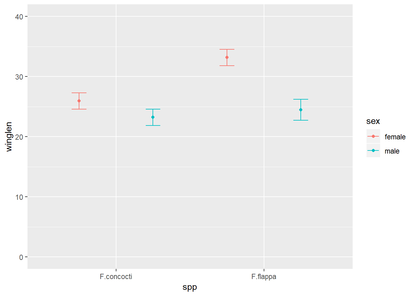
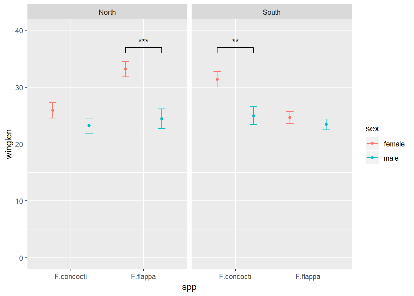
In this example the data are the wing lengths for males and females of two imaginary species of butterfly in two regions, north and south. Some of the results of a statistical analysis are shown with annotation.

1. Preparation

The first thing you want to do is make a folder on your computer where your code and the data for plotting will live. This is your working directory.
Now get a copy of the data by saving this file the folder you just made.

2. Start in RStudio

Start R Studio and set your working directory to the folder you created:

Setting your working directory

Now start a new script file:

starting a new script file

and save it as figure.R or similar.

3. Load packages

Make the packages you need available for use in this R Studio session by adding this code to your script and running it.

# package loading
library(ggplot2)
library(Rmisc)

4. Read the data in to R

The data are in a plain text file where the first row gives the column names. It can be read in to a dataframe with the read.table() command:

butter <- read.table("butterflies.txt", header = TRUE)

This each row in this data set is an individual butterfly and the columns are four variables:

  • winglen the wing length (in millimeters) of an individual
  • spp its species, one of “F.concocti” or “F.flappa”
  • sex its sex, one of “female” or “male”
  • region where it is from, one of “North” or “South”

5. Summarise the data

Our plot has the means and standard errors for each group and this requires us to summarize over the replicates which we can do with the summarySE() function:

buttersum <- summarySE(data = butter, measurevar = "winglen", 
                     groupvars = c("spp", "sex", "region"))
buttersum
##          spp    sex region  N  winglen       sd        se       ci
## 1 F.concocti female  North 10 25.93591 4.303011 1.3607315 3.078189
## 2 F.concocti female  South 10 31.37000 4.275265 1.3519574 3.058340
## 3 F.concocti   male  North 10 23.22876 4.250612 1.3441617 3.040705
## 4 F.concocti   male  South 10 24.97000 4.957609 1.5677337 3.546460
## 5   F.flappa female  North 10 33.18389 4.286312 1.3554509 3.066243
## 6   F.flappa female  South 10 24.67000 3.270423 1.0341986 2.339520
## 7   F.flappa   male  North 10 24.46586 5.492053 1.7367398 3.928778
## 8   F.flappa   male  South 10 23.45000 3.012290 0.9525696 2.154862

A group is a species-sex-region combination.

6. Plot

We have four variables to plot. Three are explanatory: species, sex and region. We map one of the explanatory variables to the x-axis, one to different colours and one to the facets.

To plot North and South on separate facets, we tell facet_grid() to plot everything else (.) for each region:

ggplot(data = buttersum, aes(x = spp, y = winglen)) +
  geom_point(aes(colour = sex), position = position_dodge(width = 1)) +
  geom_errorbar(aes(colour = sex, ymin = winglen - se, ymax = winglen + se), 
                width = .2, position = position_dodge(width = 1)) +
  ylim(0, 40) +
  facet_grid(. ~ region) 

basicfacet-1

Build understanding

This section will help you understand why facet annotations are done as they are but you can go straight to 7. Create a dataframe for the annotation information if you just want the code.

We plan to facet by region but in order to understand better, it is useful to first plot just one region. We can subset the data to achieve that:

a) Subset

# subset the northern region
butterN <- butter[butter$region == "North",]

b) Summarise data subset for plotting

butterNsum <- summarySE(data = butterN, measurevar = "winglen", 
                       groupvars = c("spp", "sex"))
butterNsum
##          spp    sex  N  winglen       sd       se       ci
## 1 F.concocti female 10 25.93591 4.303011 1.360732 3.078189
## 2 F.concocti   male 10 23.22876 4.250612 1.344162 3.040705
## 3   F.flappa female 10 33.18389 4.286312 1.355451 3.066243
## 4   F.flappa   male 10 24.46586 5.492053 1.736740 3.928778

c) Plot subset

Since we are dealing only with data from the North, we have just three variables to plot. We map one of the explanatory variables to the x-axis and the other to different colours:

ggplot(data = butterNsum, aes(x = spp, y = winglen, colour = sex)) +
  geom_point(position = position_dodge(width = 1)) +
  geom_errorbar(aes(ymin = winglen - se, ymax = winglen + se), 
                width = .2, position = position_dodge(width = 1)) +
  ylim(0, 40)

plotN1-1

  • data = butterNsum tells ggplot which dataframe to plot (the summary)
    • aes(x = spp, y = winglen, colour = sex) the “aesthetic mappings” specify where to put each variable. Aesthetic mappings given in the ggplot() statement will apply to every “layer” in the plot unless otherwise specified.
  • geom_point() the first “layer” adds points
    • position = position_dodge(width = 1) indicates female and male means should be plotted side-by-side for each species not on top on each other
  • geom_errorbar() the second layer adds the error bars. These must also be position dodged so they appear on the points.
    • aes(ymin = winglen - se, ymax = winglen + se) The error bars need new aesthetic mappings because they are not at winglen (the mean in the summary) but at the mean – the standard error and the mean + the standard error. Since all of that information is inside butterNsum, we do not need to give the data argument again.

d) Annotate this plot (i)

The annotation is composed of three lines – or segments – and some text. Each segment has a start (x, y) and an end (xend, yend) which we need to specify. The text is centered on its (x, y)

The x-axis has two categories which have the internal coding of 1 and 2. We want the annotation to start a bit before 2 and finish a bit after 2.

Note that position_dodge() units are twice the category axis units in this example.

ggplot(data = butterNsum, aes(x = spp, y = winglen, colour = sex)) +
  geom_point(position = position_dodge(width = 1)) +
  geom_errorbar(aes(ymin = winglen - se, ymax = winglen + se), 
                width = .2, position = position_dodge(width = 1)) +
  geom_text(x = 2,  y = 38, 
           label = "***", 
           colour = "black") +
  geom_segment(x = 1.75, xend = 1.75, 
           y = 36, yend = 37,
           colour = "black") +
  geom_segment(x = 2.25, xend = 2.25, 
           y = 36, yend = 37,
           colour = "black") +
  geom_segment(x = 1.75, xend = 2.25, 
           y = 37, yend = 37,
           colour = "black") +
  ylim(0, 40)

plotN-1

e) Annotate this plot (ii)

Instead of hard coding the co-ordinates into the plot, we could have put them in a dataframe with a column for each x or y as follows:

plot of chunk diag

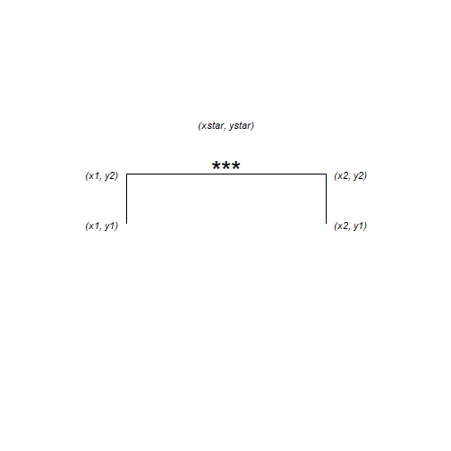
anno <- data.frame(x1 = 1.75, x2 = 2.25, y1 = 36, y2 = 37, xstar = 2, ystar = 38, lab = "***")
anno
##     x1   x2 y1 y2 xstar ystar lab
## 1 1.75 2.25 36 37     2    38 ***

Then give a dataframe argument to geom_segment() and geom_text() and the aesthetic mappings for that dataframe. We also need to move the colour mapping from the ggplot() statement to the geom_point() and geom_errorbar().

This is because the mappings applied in the ggplot() will apply to every layer unless otherwise specified and if the colour mapping stays there, geom_segment() and geom_text() will try to find the variable ‘sex’ in the anno dataframe.

ggplot(data = butterNsum, aes(x = spp, y = winglen)) +
  geom_point(aes(colour = sex), position = position_dodge(width = 1)) +
  geom_errorbar(aes(colour = sex, ymin = winglen - se, ymax = winglen + se), 
                width = .2, position = position_dodge(width = 1)) +
  ylim(0, 40) +
  geom_text(data = anno, aes(x = xstar,  y = ystar, label = lab)) +
  geom_segment(data = anno, aes(x = x1, xend = x1, 
           y = y1, yend = y2),
           colour = "black") +
  geom_segment(data = anno, aes(x = x2, xend = x2, 
           y = y1, yend = y2),
           colour = "black") +
  geom_segment(data = anno, aes(x = x1, xend = x2, 
           y = y2, yend = y2),
           colour = "black")

plotN-1

7. Create a dataframe for the annotation information

The easiest way to annotate for each facet separately is to create a dataframe with a row for each facet:

plot of chunk diag2

anno <- data.frame(x1 = c(1.75, 0.75), x2 = c(2.25, 1.25), 
                   y1 = c(36, 36), y2 = c(37, 37), 
                   xstar = c(2, 1), ystar = c(38, 38),
                   lab = c("***", "**"),
                   region = c("North", "South"))
anno
##     x1   x2 y1 y2 xstar ystar lab region
## 1 1.75 2.25 36 37     2    38 ***  North
## 2 0.75 1.25 36 37     1    38  **  South

7. Annotate the plot

Use the annotation dataframe as the value for the data argument in geom_segment() and geom_text()
New aesthetic mappings will be needed too:

ggplot(data = buttersum, aes(x = spp, y = winglen)) +
  geom_point(aes(colour = sex), position = position_dodge(width = 1)) +
  geom_errorbar(aes(colour = sex, ymin = winglen - se, ymax = winglen + se), 
                width = .2, position = position_dodge(width = 1)) +
  ylim(0, 40) +
  geom_text(data = anno, aes(x = xstar,  y = ystar, label = lab)) +
  geom_segment(data = anno, aes(x = x1, xend = x1, 
           y = y1, yend = y2),
           colour = "black") +
  geom_segment(data = anno, aes(x = x2, xend = x2, 
           y = y1, yend = y2),
           colour = "black") +
  geom_segment(data = anno, aes(x = x1, xend = x2, 
           y = y2, yend = y2),
           colour = "black")+
  facet_grid(. ~ region) 

annofacet-1

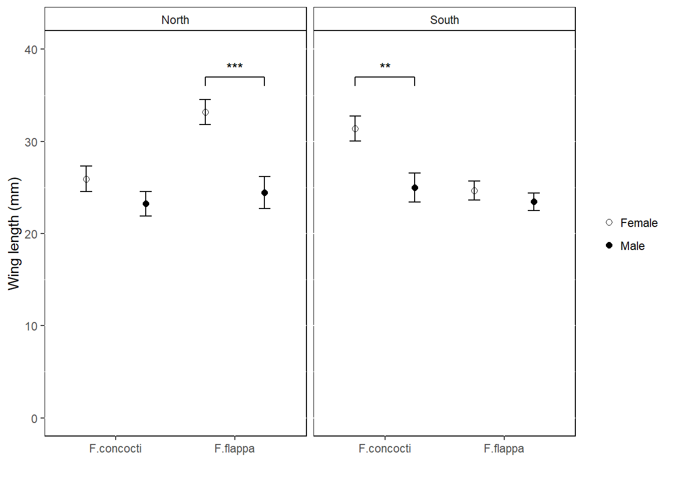
Or a little more report friendly:

ggplot(data = buttersum, aes(x = spp, y = winglen)) +
  geom_point(aes(shape = sex), position = position_dodge(width = 1), size = 2) +
  scale_shape_manual(values = c(1, 19), labels = c("Female", "Male") )+
  geom_errorbar(aes(group = sex, ymin = winglen - se, ymax = winglen + se), 
                width = .2, position = position_dodge(width = 1)) +
  ylim(0, 40) +
  ylab("Wing length (mm)") +
  xlab("") +
  geom_text(data = anno, aes(x = xstar,  y = ystar, label = lab)) +
  geom_segment(data = anno, aes(x = x1, xend = x1, 
           y = y1, yend = y2),
           colour = "black") +
  geom_segment(data = anno, aes(x = x2, xend = x2, 
           y = y1, yend = y2),
           colour = "black") +
  geom_segment(data = anno, aes(x = x1, xend = x2, 
           y = y2, yend = y2),
           colour = "black")+
  facet_grid(. ~ region) +
  theme(panel.background = element_rect(fill = "white", colour = "black"),
        strip.background = element_rect(fill = "white", colour = "black"),
        legend.key = element_blank(),
        legend.title = element_blank())

annofacet2-1

If you want to add images to each facet you can use the ggimage package. I covered this in a previous blog, Fun and easy R graphs with images
You need to add column to your annotation dataframe.

Package references

Hope R.M. (2013). Rmisc: Rmisc: Ryan Miscellaneous. R package version 1.5. https://CRAN.R-project.org/package=Rmisc

Wickham H. (2016). ggplot2: Elegant Graphics for Data Analysis. Springer-Verlag New York. ISBN 978-3-319-24277-4

Yu G. (2018). ggimage: Use Image in ‘ggplot2’. R package version 0.1.7. https://CRAN.R-project.org/package=ggimage

R and all it’s packages are free so don’t forget to cite the awesome contributors.
How to cite packages in R