


It’s easy to animate graphs in R
In this post am I going to show you how easy it is to animate figures in R thanks to the great ggplot2 extension gganimate written by Thomas Lin Pedersen and David Robinson
This is something you might want to do to increase the impact of your work by communicating it through twitter, a website or live in a presentation.
Imagine you have carried out an experiment to test whether the growth of different Ralstonia solanacearum strains could be inhibited by a treatment X. R.solanacearum is a bacterium which causes many plant diseases so controlling it is beneficial. You measured the growth of each strain of R.solanacearum with and without the potential inhibitor (treatment X vs control) each day for 20 days and you did five replicates of each treatment combination.
Your dataset will have: 5 strains x 2 treatments x 20 days x 5 replicates = 1000 rows. For a report or article you might highlight the difference between the strains in their response to the treatment by plotting the last time point only. Something like this:

Or perhaps you’d like to emphasize the effects of treatment and time (and average over the strains) like this:

Or try to show time, strain and treatment on one graph:

However, if your communication medium allows it, animation is a space-efficient and easily understood way to illustrate your results.
I will assume you have R Studio installed and have at least a little experience with it but I’m aiming to make this do-able for novices.
1. Preparing
The first thing you want to do is make a folder on your computer in where your code and the data for plotting will live. This is your working directory.
Now get a copy of the data by saving this file. The important thing is to save it to your working directory (the folder you just made).
2. Getting started in RStudio
Start R Studio and set your working directory to the folder you created:

Now start a new script file:

and save it as animatedfigure.R or similar.
You will need the devtools package to install gganimate
devtools and gganimate are already installed for biologists at the University of York. If you are on your own computer you will need to install them.
To do this you first install devtools in the normal way. Click the install button and write the package name in the box to install it.

R Studio may need to install additional packages. You will also need the Rmisc package for summarizing data so install that too.
You can now use the install_github() function in the devtools package to install gganimate:
# install gganimate from github
devtools::install_github("thomasp85/gganimate")
When everything is finished, you are ready to start coding!
3. Starting to code
Make the packages available for use in this R Studio session by adding this code to your script and running it.
# load the gganimate and Rmisc packages
library(gganimate)
library(Rmisc)
4. Read the data in to R
The data are in a plain text file where the first row gives the column names. It can be read in to a dataframe with the read.table() command:
ralstonia <- read.table("ralstonia.txt", header = TRUE)
5. Summarising the data for plotting
We need the means and standard errors for each group. This requires us to summarize over the replicates which we can do with the summarySE():
ralstoniasum <- summarySE(data = ralstonia, measurevar = "OD",
                 groupvars = c("strain", "treatment","day"))
6. A static figure
We can get a default figure of the last time point only this:
ggplot(data = ralstoniasum[ralstoniasum$day == 19,], aes(x = strain, y = OD, fill = treatment )) +
  geom_bar(stat = "identity",colour = "black", position = position_dodge()) +
  geom_errorbar(aes(ymin = OD - se, ymax = OD + se),
                width = 0.3, position = position_dodge(0.9))
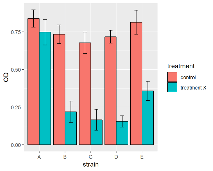
ralstoniasum[ralstoniasum$day == 19,] means only the last time point is plotted rather than the whole of ralstoniasum
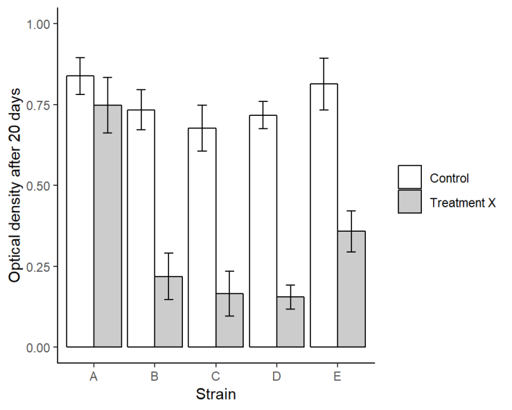
Or we make it a bit more publication friendly with some extra code:
ggplot(data = ralstoniasum[ralstoniasum$day == 19,], aes(x = strain, y = OD, fill = treatment )) +
  geom_bar(stat = "identity",colour = "black", position = position_dodge()) +
  geom_errorbar(aes(ymin = OD - se, ymax = OD + se),
                width = 0.3, position = position_dodge(0.9)) +
  scale_fill_manual(values = c("#FFFFFF", "#CCCCCC"),
                    labels = c("Control", "Treatment X"),
                    name = NULL)+
  xlab("Time (days)") +
  ylab("Optical density after 20 days") +
  ylim(0, 1) +
  theme(panel.background = element_rect(fill = "white"),
        axis.line.x = element_line(color = "black"),
        axis.line.y = element_line(color = "black"))
7. Animating!
Animating the figure over time requires the addition of just one line! transition_time(day):
ggplot(data = ralstoniasum, aes(x = strain, y = OD, fill = treatment )) +
  geom_bar(stat = "identity",colour = "black", position = position_dodge()) +
  geom_errorbar(aes(ymin = OD - se, ymax = OD + se),
                width = 0.3, position = position_dodge(0.9)) +
  transition_time(day)

Or two lines if you want to show the days ticking through:
ggplot(data = ralstoniasum, aes(x = strain, y = OD, fill = treatment )) +
  geom_bar(stat = "identity",colour = "black", position = position_dodge()) +
  geom_errorbar(aes(ymin = OD - se, ymax = OD + se),
                width = 0.3, position = position_dodge(0.9)) +
  transition_time(day) +
  labs(title = "Day: {frame_time}")

** Magic! **
Hope you enjoyed it and found it easy to follow.
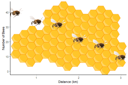
By combining the instructions above with those in Fun and easy R graphs with images and using this image, you should be able to work out how to get the figure at the top!
This design and the data are made-up but were inspired by the work of Microbiology PhD Student Sophie Clough in the Friman lab headed by Ville-Petri Friman.
Package references
R and all it’s packages are free so don’t forget to cite the awesome contributors.
How to cite packages in R
Hope, R.M. (2013). Rmisc: Rmisc: Ryan Miscellaneous. R package version 1.5. https://CRAN.R-project.org/package=Rmisc
Pedersen, T.L. and Robinson, D. (2017). gganimate: A Grammar of Animated Graphics. R package version 0.9.9.9999. http://github.com/thomasp85/gganimate
Wickham H. (2016). ggplot2: Elegant Graphics for Data Analysis. Springer-Verlag New York. ISBN 978-3-319-24277-4
Wickham, H., Hester, J. and Chang W. (2018). devtools: Tools to Make Developing R Packages Easier. R package version 1.13.6. https://CRAN.R-project.org/package=devtools


